
The Pinterest logo is one of the most recognizable symbols in the world of social media and visual discovery. With its distinctive red color and elegant “P” design, the logo has become synonymous with creativity, inspiration, and digital bookmarking. Whether you’re a designer, marketer, entrepreneur, or casual Pinterest user, understanding the story behind the Pinterest logo offers valuable insights into modern branding and visual identity.
Since its launch, Pinterest has grown into a global platform where millions of users discover ideas related to fashion, home décor, recipes, travel, and business. Throughout this journey, the Pinterest logo has played a crucial role in establishing trust, recognition, and brand consistency. This article explores the history, meaning, design elements, evolution, and influence of the Pinterest logo in depth.
The History of the Pinterest Logo
Pinterest was founded in 2010 by Ben Silbermann, Paul Sciarra, and Evan Sharp. The platform quickly gained popularity because it provided a unique way for users to collect and organize visual content. From the very beginning, the Pinterest logo was designed to reflect the platform’s core mission: helping users “pin” ideas and inspirations for future reference.
The original Pinterest logo featured a scripted wordmark that emphasized elegance and creativity. Inspired by traditional typography and vintage design styles, the logo gave the platform a welcoming and artistic personality. During its early growth phase, this branding helped Pinterest stand out among social media competitors that often relied on more corporate-looking identities.
As Pinterest expanded globally, the company recognized the need for a more versatile visual identity. The logo evolved to ensure better visibility across mobile applications, websites, advertisements, and digital products. Despite these updates, the company carefully preserved the core visual elements that users had come to recognize and trust.
Another important aspect of the Pinterest logo’s history is its consistency. While many technology companies have undergone dramatic rebranding efforts, Pinterest chose a more gradual evolution. This strategy helped maintain brand recognition while adapting to modern design trends and digital requirements.
Meaning and Symbolism Behind the Pinterest Logo
The Pinterest logo is more than just a visual mark. It carries significant symbolism that aligns perfectly with the platform’s purpose and user experience. At its core, the logo represents discovery, creativity, organization, and inspiration.
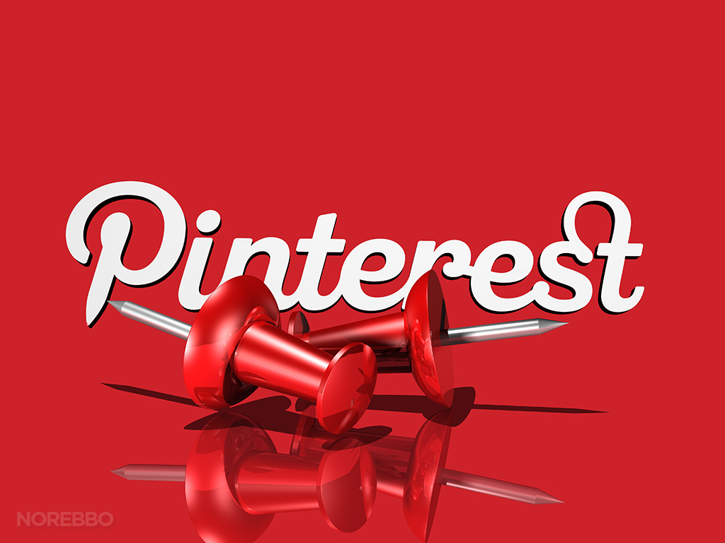
The iconic letter “P” in the Pinterest logo resembles a pushpin. This design choice directly connects to the concept of pinning ideas onto a board. Traditionally, people use pushpins to attach notes, photographs, and reminders to bulletin boards. Pinterest transformed this familiar physical behavior into a digital experience, and the logo reflects that transition beautifully.
The logo also symbolizes creativity and personal expression. Users come to Pinterest seeking inspiration for projects, hobbies, lifestyles, and professional goals. The elegant design communicates a sense of imagination and possibility, encouraging users to explore new ideas and save what inspires them.
Additionally, the Pinterest logo represents organization. Unlike many social platforms focused on real-time conversations, Pinterest emphasizes collecting and categorizing content. The logo’s clean structure and recognizable shape reinforce this concept of order and visual curation.
The combination of functionality and symbolism makes the Pinterest logo a powerful branding tool. It successfully communicates the platform’s mission without relying on excessive visual complexity.
Design Elements That Make the Pinterest Logo Unique
One of the reasons the Pinterest logo stands out is its carefully crafted design. Every aspect of the logo contributes to its effectiveness and memorability. From color choices to typography, each element serves a strategic purpose.
The most noticeable feature is the logo’s red color. Red is often associated with energy, passion, excitement, and action. For Pinterest, this color choice encourages engagement and creativity. The bold red background used in the app icon immediately attracts attention and creates a strong visual presence across digital platforms.
Typography also plays a critical role in the Pinterest logo. The brand has historically used custom lettering that balances elegance and readability. The smooth curves and refined appearance create a friendly yet professional impression. This typography helps Pinterest appeal to a diverse audience ranging from casual users to business professionals.
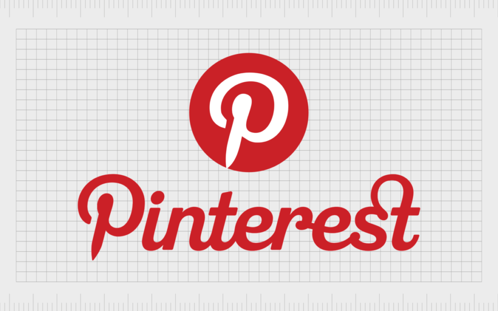
The circular icon surrounding the “P” contributes to visual simplicity. Circular logos are often perceived as approachable, complete, and trustworthy. The clean shape ensures the logo remains recognizable even at small sizes, making it ideal for mobile devices and social media profiles.
Another unique characteristic is scalability. Modern brands require logos that function across multiple platforms and screen sizes. The Pinterest logo performs exceptionally well in this regard. Whether displayed on a smartphone icon, website header, billboard, or advertisement, the design maintains clarity and impact.
These design choices demonstrate how simplicity and strategic branding can create a lasting visual identity that resonates with users worldwide.
Evolution of the Pinterest Logo Over Time
Like many successful technology brands, Pinterest has refined its visual identity over the years. However, unlike companies that frequently redesign their logos, Pinterest adopted a measured and thoughtful approach to evolution.
In its early years, Pinterest relied heavily on a script-style wordmark that emphasized personality and creativity. This version reflected the platform’s startup culture and niche audience. As the company expanded, designers recognized the need for a cleaner and more adaptable logo system.
The most significant evolution involved the icon itself. The stylized “P” became the central focus of the brand identity. This shift allowed Pinterest to strengthen recognition across mobile applications and digital environments where compact icons are essential.
Pinterest also modernized its typography to improve readability and consistency. These updates aligned the brand with contemporary design standards while preserving its established identity. The company avoided radical changes that might confuse users or weaken brand equity.
The logo evolution reflects broader trends in digital branding. Many technology companies have moved toward minimalism, simplicity, and scalability. Pinterest successfully embraced these trends while maintaining the symbolic pushpin concept that defines its visual identity.
Today, the Pinterest logo is widely regarded as a successful example of logo modernization. It balances tradition and innovation, allowing the brand to remain relevant in an ever-changing digital landscape.
Why the Pinterest Logo Is Important for Branding
The Pinterest logo serves as a powerful example of effective branding in the digital age. A strong logo does more than identify a company—it communicates values, builds trust, and creates emotional connections with users.
One of the logo’s greatest strengths is instant recognition. Millions of people can identify the Pinterest logo within seconds. This level of recognition is invaluable because it reduces the effort required for users to connect with the brand.
The logo also supports brand consistency. Pinterest uses its visual identity across websites, mobile applications, marketing campaigns, and business products. Consistent branding strengthens credibility and helps users feel confident when interacting with the platform.
Another branding advantage is emotional association. The Pinterest logo has become linked with inspiration, creativity, and personal achievement. Users often visit Pinterest when planning weddings, decorating homes, starting businesses, or pursuing hobbies. As a result, the logo becomes associated with positive experiences and aspirations.
From a marketing perspective, the Pinterest logo helps differentiate the platform from competitors. While other social media companies focus on communication or entertainment, Pinterest emphasizes visual discovery and idea organization. The logo reinforces this unique positioning.
Businesses and marketers can learn valuable lessons from the Pinterest logo. Its success demonstrates the importance of simplicity, symbolism, consistency, and adaptability in building a memorable brand identity.
Frequently Asked Questions (FAQs)
1. What does the Pinterest logo represent?
The Pinterest logo represents creativity, inspiration, discovery, and the concept of digitally pinning ideas for future reference.
2. Why is the Pinterest logo red?
The red color symbolizes energy, passion, and engagement while helping the brand stand out visually.
3. What is the meaning of the “P” in the Pinterest logo?
The stylized “P” resembles a pushpin, reflecting Pinterest’s digital pinning concept.
4. When was Pinterest founded?
Pinterest was founded in 2010.
5. Has the Pinterest logo changed over time?
Yes, the logo has undergone refinements and modernization while retaining its core identity.
6. Who designed the Pinterest logo?
Pinterest’s branding and logo design evolved through collaboration between internal teams and professional designers over the years.
7. Why is the Pinterest logo so recognizable?
Its simple design, bold color, and unique symbolism contribute to strong brand recognition.
8. What makes the Pinterest logo effective?
Its simplicity, scalability, symbolism, and consistency make it highly effective.
9. Is the Pinterest logo trademarked?
Yes, the Pinterest logo is a protected trademark owned by Pinterest.
10. What branding lessons can businesses learn from the Pinterest logo?
Conclusion
The Pinterest logo is much more than a simple visual symbol. It represents creativity, inspiration, organization, and discovery—the very qualities that have made Pinterest one of the world’s most popular visual platforms. Through thoughtful design, meaningful symbolism, and careful evolution, the logo has become an iconic element of modern digital branding.
From its early script-style identity to its streamlined contemporary appearance, the Pinterest logo reflects the company’s growth while preserving its core mission. Its recognizable pushpin-inspired “P,” bold red color, and clean design continue to resonate with millions of users around the globe. As Pinterest evolves in the future, its logo will likely remain a powerful symbol of creativity and visual exploration.